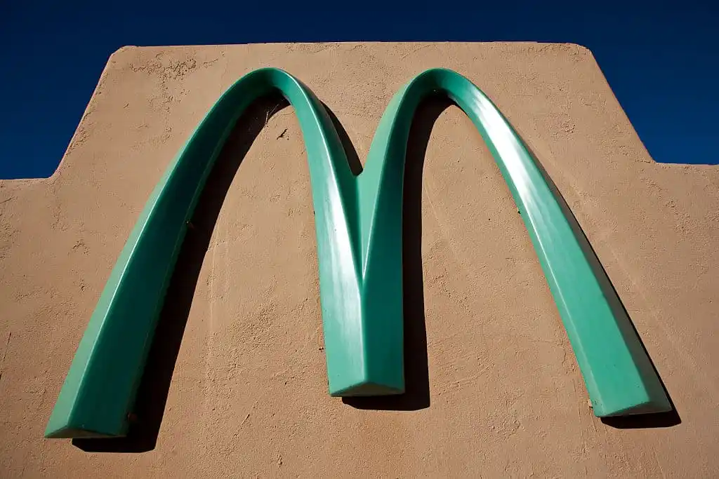
In the world of business, brand consistency is king. McDonald’s golden arches are one of the most recognized logos on the planet, a symbol of uniformity and reliability. However, one location in Sedona, Arizona, proves that strategic adaptation can be even more powerful. In this desert town, the arches shine in a unique turquoise blue, creating a landmark that has become famous worldwide. This distinctive feature wasn’t a marketing stunt, but the result of a smart negotiation between a global corporation and a determined local community.
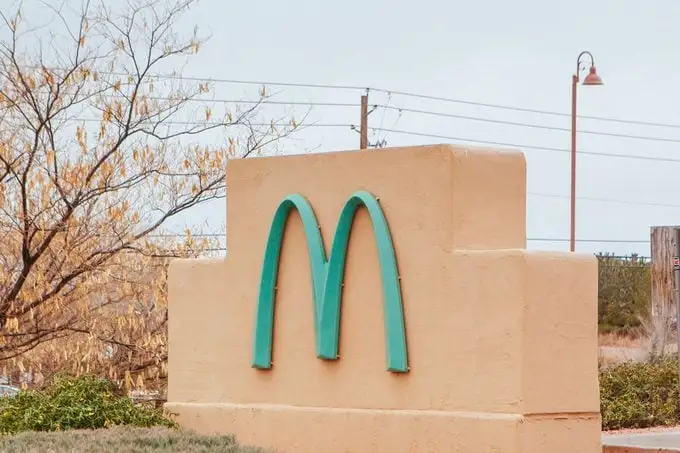
The city of Sedona has rigorous aesthetic codes to protect its breathtaking natural scenery, characterized by dramatic red rock formations. When McDonald’s arrived in the early 1990s, the city council was concerned that the bright yellow logo would be an eyesore. Rather than issuing a flat denial, they worked with the company to find a solution. The result was a agreement to repaint the arches in a color that would harmonize with the environment. The chosen turquoise was both aesthetically pleasing and culturally significant, paying homage to the region’s Native American heritage.
This decision transformed the Sedona McDonald’s from just another franchise into a destination. It became a celebrated example of how a multinational corporation can successfully integrate into a local community by respecting its values and identity. The turquoise arches demonstrate that brand flexibility, when done thoughtfully, can generate immense goodwill and turn a business into a beloved local icon. It’s a powerful case study in balancing global brand power with local sensitivity, showing that sometimes, blending in is the best way to stand out.